nullprogram.com/blog/2009/05/01/
Here's something interesting I saw on Wikipedia. There is a map of the
US with states colored according to the spread of the H1N1 flu
epidemic. Take a look:
H1N1_USA_Map.svg. The interesting part is actually at the bottom
of that image page.
Wikipedia, being a wiki, versions everything. It has to. No one
actually changes a page, they just add a new version that is a
derivative of the "current" version. Because of this, Wikipedia has
incidentally created a time-lapse version of the map in its version
control system. In case you can't see it when you are reading this,
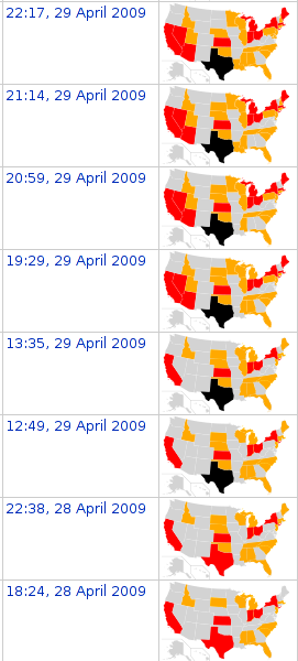
here's what part of it looks like,

That's the timestamp and the state of the spread at that time,
presented in an extremely useful way. And this was created by
accident. Pretty cool, eh?