nullprogram.com/blog/2009/08/05/
Update November 2011: I've since spent a lot more time with widescreen
monitors, and the web has changed a bit, so I somewhat changed my mind
about this topics, as you can see by the page around you.
Web pages aren't a static medium, like books, brochures, or
pamphlets.
The web is not print. Accordingly, the layout of web pages should
not be locked to some static width, but instead flow to fill the width
of the browser like a liquid. Web pages should normally have a
liquid layout.
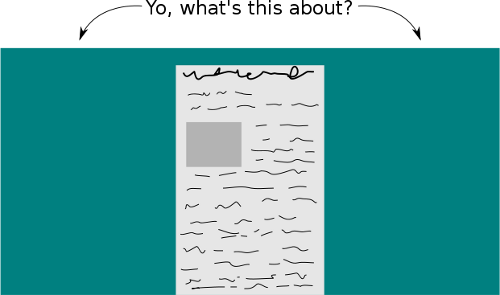
One of the most obvious problems with the fixed layout occurs when the
browser window is stretched wider than the designer had intended.

I, as a user, have little control my viewing of the website. I'm stuck
reading through a keyhole. It gets much worse if the browser isn't as
wide as the designer intended: a horizontal scrollbar appears and
navigation becomes very difficult. My laptop runs at a resolution of
1024x768, and I frequently come across pages where this is an
issue. And according to Jakob Nielsen, in 2006 77% of
user's screens were 1024 pixels wide or less.
See the liquid for yourself right here: adjust the width of your
browser and watch this text flow to fill the screen. You can also
bring it in pretty far before you clip an image and the horizontal
scrollbar appears. The exact width depends only on the widest image
being displayed. This also comes into play if you adjust the font
size.
Using a liquid layout
allows the page to work well with a wide variety of screen widths,
and most importantly, gives users lots of control over how they view
the site. It's very unfortunate that (in my experience) most websites
employ a poor, fixed layout. Even web design "expert" websites will
ironically hand out web design tips from within these annoying
confines. One of the biggest culprits driving this is Wordpress, which
has this flawed layout by default.
The very worst offenders tend to be websites with little actual
content, like corporate websites or "artist" portfolios. The less
usable the page, the less I wanted to be there anyway.
So please drop the fancy, low-usability web designs for
something with much better usability. Your users will probably
appreciate it.