nullprogram.com/blog/2011/03/06/
Two years ago I posted about making movie
montages with mplayer, and one of the movies I did was the
original Tron. Since then the 30-years-later sequel came
out, Tron: Legacy. The original post has pulled in a lot of
hits in the last few months from people looking for Tron-themed
wallpaper, so I may at well follow it up with a new image. I think the
comparison between the old and new is interesting, because color plays
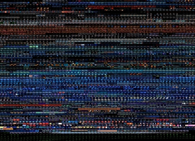
an important role in the Tron world. Here's the original Tron
montage again. As before, each row is one minute of film.

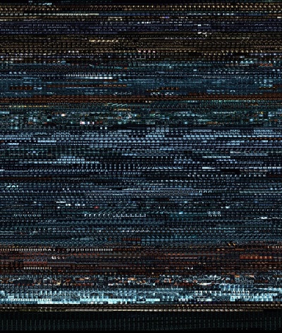
And here's the new film, Tron: Legacy,

The most obvious difference is that the the sequel is much longer. The
color blue continues to be a prevalent theme, though I'd say the
sequel's blue is more "serious." Both entered the computer world about
the same amount of time into the film, and because the sequel is
longer it has a larger portion of the film taking place there. Both
have an increase in antagonist red just before the end, for
the Boss
Battle.